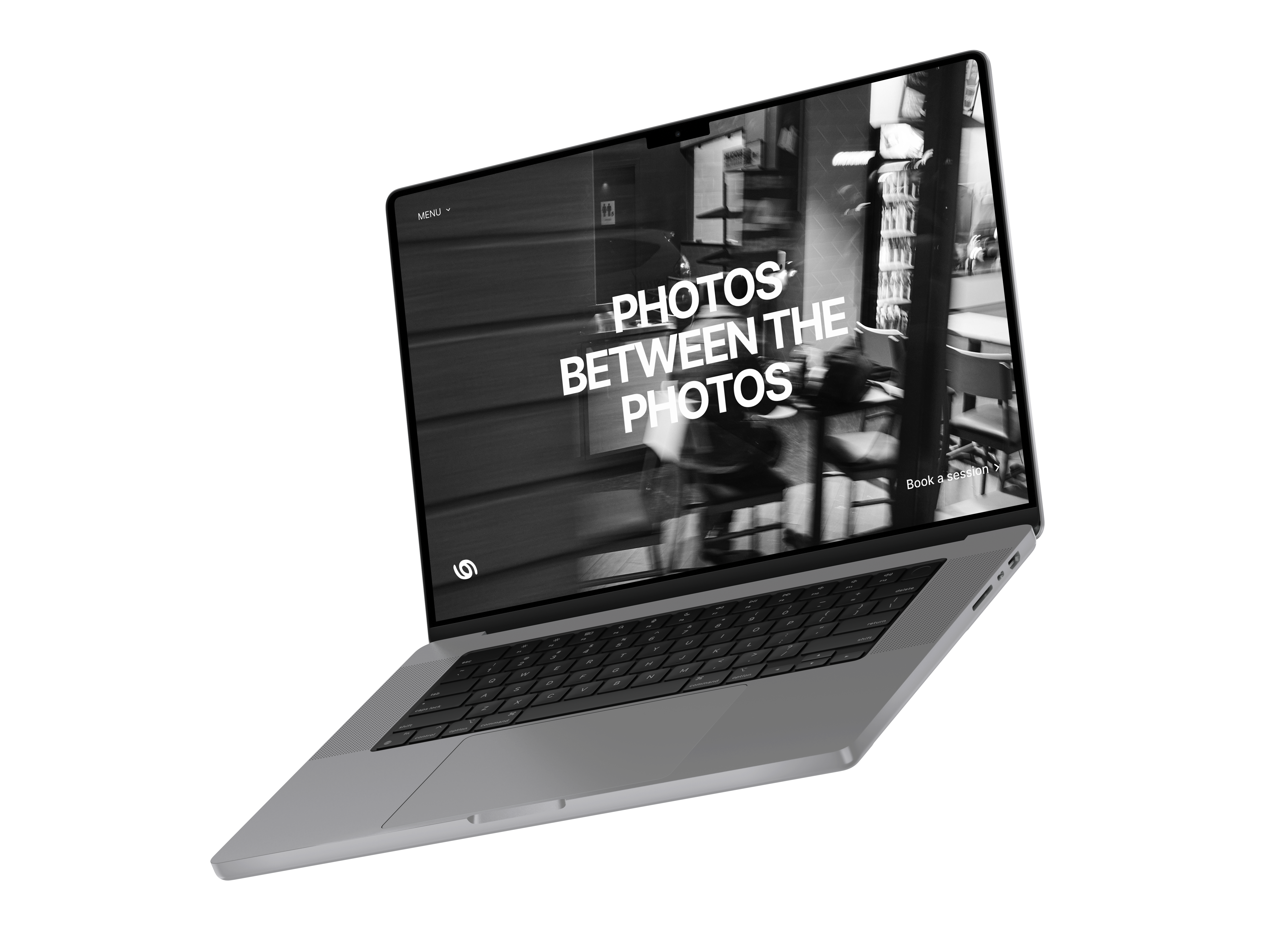
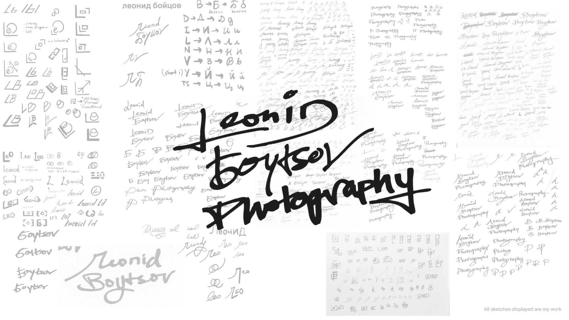
Due to the nature of his work, full bleed images would present his photography in its full glory and sincerity, and that was the intention diving into the design of the website. In the first client meeting, we discussed about what he envisioned his logo and brand to look and feel like, and he wanted to avoid cliché photography iconography such as an aperture and camera related parts. In most meetings, the conversation often came back to reflecting a personal and heartfelt essence, thus taking a handwritten path to display his name as the logo. We intended for the design to be minimal to let the images speak on his behalf, thus we adopted the Swiss style design.